React & Styled components
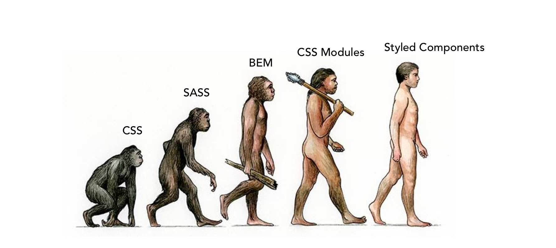
As the modern applications are more and more complex and dynamic, the ways of styling the page has developed as well. From simple CSS we went to more sophisticated tools.
Modern UI development
A bit of history
As the modern applications are more and more complex and dynamic, the ways of styling the page has developed as well. From simple CSS we went to more sophisticated tools.
Preprocessors like Sass and less are an extension of CSS that adds power and elegance to the basic language. It allows you to use variables, mixins, conditions, nesting and extends. Unfortunately it didn’t save us from one !important problem. The issue of rewriting existing rules still remained. So, we had to came up with naming conventions like BEM.
BEM
BEM (Block - Element - Modifier) is a way of naming classes so all classes are unique, which eliminates the issue of overriding the rules.
Block
Standalone entity that is meaningful on its own (.panel, .container, .form)
Element
A part of a block that has no standalone meaning and is semantically tied to its block
(.panel__header, .container__title, .form__input)
Modifier
A flag on a block or element. Use them to change styles or behavior
(.input--highlighted, .input--disabled)
The idea
Besides that, BEM is a bit more than just a naming convention. It leads us to think about the elements as a separate components, from which we are building our application. Why is that cool?
Structure
BEM methodology gives your CSS code a solid structure that remains simple and easy to understand
Avoiding descendant selector
The descendant selector is very costly, as the browser must check for a match with every descendant element. On a complex web page, this can result in thousands and thousands (perhaps even more) of descendant selector searches. It is so expensive because the relationship isn’t restricted to parent and child.
Modularity
Block styles are never dependent on other elements on a page, so you will never experience problems from cascading. You also get the ability to transfer blocks from your finished projects to new ones
Reusability
Composing independent blocks in different ways, and reusing them intelligently, reduces the amount of CSS code that you will have to maintain. With a set of style guidelines in place, you can build a library of blocks, making your CSS super effective.
CSS modules
CSS Modules is not an official spec or an implementation in the browser but rather a process in a build step (with the help of Webpack or Browserify) that changes class names and selectors to be scoped (i.e. kinda like namespaced). Which pretty much means, that the classes we define exists only in one component, so we don’t have to worry about unique naming. We can also simply combine them with css preprocessors like less or sass.
import styles from "./styles.css";
element.innerHTML =
  `<h1 class="${styles.title}">
     An example heading
   </h1>`;
Our generated HTML might look like this:
<h1 class="_styles__title_309571057">
  An example heading
</h1>
And our generated CSS might look like this:
._styles__title_309571057 {
  background-color: red;
}
Styled components
Finally, the Styled components took it even one step further. It allows us to define the style of components right in JavaScript, which leads to component with both style and logic in one place. This means that when you’re defining your styles, you’re actually creating a normal React component, that has your attached styles.
Apart from the improved experience for developers, styled-components provides:
Automatic critical CSS
styled-components keeps track of which components are rendered on a page and injects their styles and nothing else, fully automatically. Combined with code splitting, this means your users load the least amount of code necessary.
No class name bugs
styled-components generates unique class names for your styles. You never have to worry about duplication, overlap or misspellings.
Easier deletion of CSS
it can be hard to know whether a class name is used somewhere in your codebase. styled-components makes it obvious, as every bit of styling is tied to a specific component. If the component is unused (which tooling can detect) and gets deleted, all its styles get deleted with it.
Simple dynamic styling
adapting the styling of a component based on its props or a global theme is simple and intuitive without having to manually manage dozens of classes.
Painless maintenance
you never have to hunt across different files to find the styling affecting your component, so maintenance is a piece of cake no matter how big your codebase is.
Automatic vendor prefixing
write your CSS to the current standard and let styled-components handle the rest. You get all of these benefits while still writing the CSS you know and love, just bound to individual components.
How does it look like?
We can simply style base HTML elements
const Button = styled.button`
  /* Adapt the colors based on primary prop */
  background: ${props => props.primary ? "palevioletred" : "white"};
  color: ${props => props.primary ? "white" : "palevioletred"};

  font-size: 1em;
  margin: 1em;
  padding: 0.25em 1em;
  border: 2px solid palevioletred;
  border-radius: 3px;
`;

render(
  <div>
    <Button>Normal</Button>
    <Button primary>Primary</Button>
  </div>
);
Or our whole custom React component
// This could be react-router-dom's Link for example
const Link = ({ className, children }) => (
  <a className={className}>
    {children}
  </a>
);

const StyledLink = styled(Link)`
  color: palevioletred;
  font-weight: bold;
`;

render(
  <div>
    <Link>Unstyled, boring Link</Link>
      <br />
    <StyledLink>Styled, exciting Link</StyledLink>
  </div>
);

